I needed a change, so I changed the look of my blog today. I wouldn’t mind trying a new theme, but I’m afraid it might mess up the blog, so I’m afraid to try that.
Here was the look I had until today:
Please vote in the poll for which design you like better. Thank you.
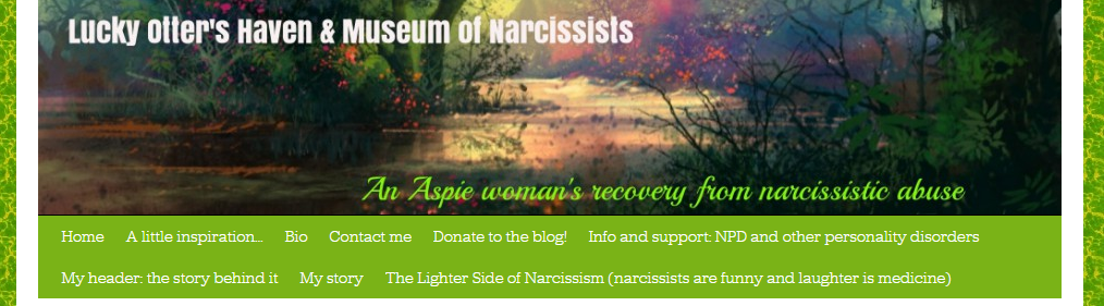
Below was my very first design. I didn’t have that many pages added in the header yet and no text in the graphic. 🙂
The Wayback Machine is a very cool site–it takes pictures of your site on random dates and saves them in its database. 🙂 It comes in very handy.


I liked the colorful one better. But the otters are really cool.
LikeLiked by 1 person
I just needed a change. I was getting tired of the old design. I like the otters but wonder if it’s not bright enough. I like the silver grey though too.
LikeLike
when you change a theme, it also changes your dash board, I figured this out while helping my son create his blog, his dashboard is radically different than mine, I’m just going to permanently leave my blog as it is, it kind of freaked my son and I out as we changed his themes
LikeLiked by 1 person
Yikes! it took me forever to figure out this dashboard. I would love to play around with the theme but i’m skeered! 😮
LikeLike
There’s a practical reason for the change too. Because the name of my blog was embedded in the graphic, in order to avoid redundancy i had to either leave the title blank (and then it shows up as [no title] in the reader, so I put a sort of teaser there (“A safe place”) but then it looked like that was the name of the blog, which it isn’t. By just putting the one descriptive line in the graphic instead of the whole title, I could put the title back in the field for it, and now it shows up in the reader and elsewhere with the correct name.
LikeLike
Looks nice, I like it.
LikeLiked by 1 person
I think I really do too. 🙂
LikeLiked by 1 person
I like it. The background is much calmer.
LikeLiked by 1 person
I agree.
LikeLiked by 1 person
Yes I already said I thought you changed something. I thought maybe it was a haircut, or some such. I like the new flavors of your blog! Looking good!
LikeLiked by 1 person