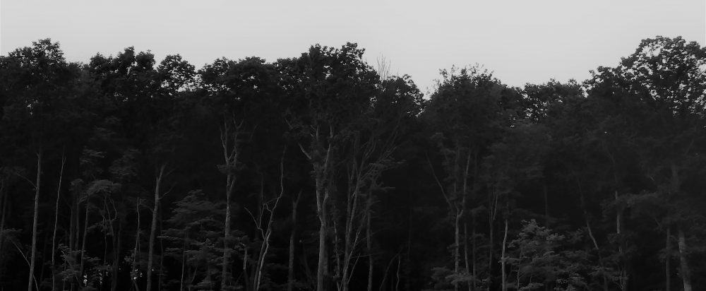
I decided to completely change the header, background and blurb. I think it’s cleaner and less clunky looking, and it was time for something new. I hope everyone likes it.
Lucky Otters Haven
Ruminations, ramblings, and rants about narcissism and trauma, politics, human nature, religion, pop culture, writing, and almost everything else

the change is nice. I come by for the posts not the view, lol – but it’s a nice setup. good choice.
LikeLiked by 1 person
I’m glad you like it. I hope people don’t think they’re on the wrong site, because other than the color, it looks nothing like the old site.
LikeLike
It’s nice but I like the older one better.
LikeLiked by 1 person
Really? Maybe you’re just more used to it.
LikeLike
Wow, this is different. A bit “Matrix hive”-like though, whereas the otter pattern was cute. Always room for improvement, so not to bother you—just a comment.
LikeLiked by 1 person
It was such a big change from your previous look that even I, who rarely notices things like this, was struck by it. Thought I’d wait to comment, though, until you actually mentioned it. Since green is one of my favorite colors, I like it.
LikeLiked by 1 person
I think it’s sharper looking, but I’m also worried it might look too plain.
LikeLike
Between the bright green and the hexagon patterns, it’s plenty busy enough for me. Go worry about something more important, OK?
LikeLiked by 1 person